Udacity Classroom Experience
I designed custom illustrations for Udacity's lessons to improve the online classroom experience, which led to boosting the platform's visual appeal and its educational impact.
Role
Visual Designer
Responsibilities
Illustration, Branding
Tools
Sketch, Illustrator
Overview
Udacity is an online learning platform that offers world-class programs in cutting-edge fields. Their mission is to make education accessible to all and inspire lifelong learners to pursue their ambitions. They call their certificate programs "Nanodegree Programs." To stand out among many online education choices, Udacity relies on strong branding to highlight its unique programs and provide high-quality learning experiences.
Udacity recognized the need to visually represent each lesson within their online classroom. They had previously relied on generic stock images, resulting in an inconsistent classroom experience that didn't align with their brand. The use of stock photos also posed challenges related to the timely updates of lessons and Nanodegrees. I collaborated with two other Designers during the initial style development process. Once we streamlined that process we would each design our own illustrations of our assigned Nanodegree class.
previous version
Teams
Product Team
2 Designers
Timeline
2 Weeks
The Problem
Udacity's online classroom relied on repetitive, generic stock photos, resulting in an inconsistent user experience and offering little aid in comprehending the lesson topics.
Solution
Learn about the class topic
At the start of each new class, we initiated a kickoff meeting with the class lead to gain insights into the topic. They would often share descriptions for each lesson and we had the added benefit of being able to access and review the lessons themselves.
Sketch & illustrate
Once we understood the class theme for each Nanodegree, we would jump right into sketching ideas for each lesson. With some practice, we got pretty good at quickly creating illustrations. After the sketching phase, we vectorized the illustrations using Sketch.
Approve
I shared the lesson illustrations, occasionally presenting different options for specific lessons as required. The class lead would then provide feedback and give the green light to the final images.
Challenges
Process Development
At the start, we weren't quite sure how to design illustrations for topics we weren't familiar with. It meant spending a good chunk of time diving into lessons to get a handle on the topics. But as we completed more Nanodegrees, we improved our approach and developed a more efficient process. We collaborated with the class leads to create a spreadsheet that included basic descriptions and visual concepts to convey their ideas. We only dug deep into specific lessons when we felt it was needed for an in-depth understanding. Additionally, we streamlined the process by having an established design style. We ended up reducing the timeline significantly from a month to just two weeks or even less.
Old Lesson Images
Difficult to source stock photos
Time-consuming to source photos that worked
Images did not represent the topics accurately and they would often use the same image repeatedly
Images that were sourced were not on brand
Original Illustration Style

Previous illustration style
Udacity’s brand had some established illustrations but the style was too detailed for the classroom lessons. So, it was our task to come up with a more simple style that would align with their brand and should also be easy to recreate by multiple designers. Additionally, the illustrations should work without a reference to a specific language.
Style Explorations
First Iteration
First Iteration
In the first style exploration, I started with the existing Udacity illustrations as a foundation. I used a similar line weight as the original but simplified the details. Additionally, I experimented with incorporating a gradient background to create a bolder look that would stand out in the classroom experience. The background colors were aligned with the Nanodegree branding to create a cohesive feel.
Upon presenting these designs to the team, their feedback indicated that they liked the direction but the illustrations were still too detailed, and the background was somewhat distracting.
Second Iteration
Second Iteration
Based on their feedback, I made some refinements by simplifying the illustrations further, increasing the line weight, and using color more intentionally. I kept the background light to ensure that the illustrations were the main focus. I developed a style in which the line colors remained consistent while introducing an extra key color that would help accentuate specific actions or elements within the illustration. These key colors also created a unique style for each Nanodegree.
Design Guide
Final Design Guide
Once we had the final design style approved, I set up some guides for other designers to follow. We also needed to consider web responsiveness, which meant we had to work within certain limitations. We needed to consider how the design would adapt to various screen sizes. I found the viewable safe area and added a guide to keep the illustrations within those limits. In the end, we had a design style with plenty of open space that allowed for the illustrations to shine.
Process

The Final Process
After finalizing the illustration style, we established a streamlined process. We started by studying each topic, sketching out each lesson, vectorizing the illustrations, and then presenting them for approval. Thanks to this method, I successfully designed hundreds of illustrations across multiple Nanodegree programs, covering a wide range of topics.
Example Presentation
We prepared presentations displaying various versions of a lesson image to gather feedback from the class lead.

Final Lesson Images Style
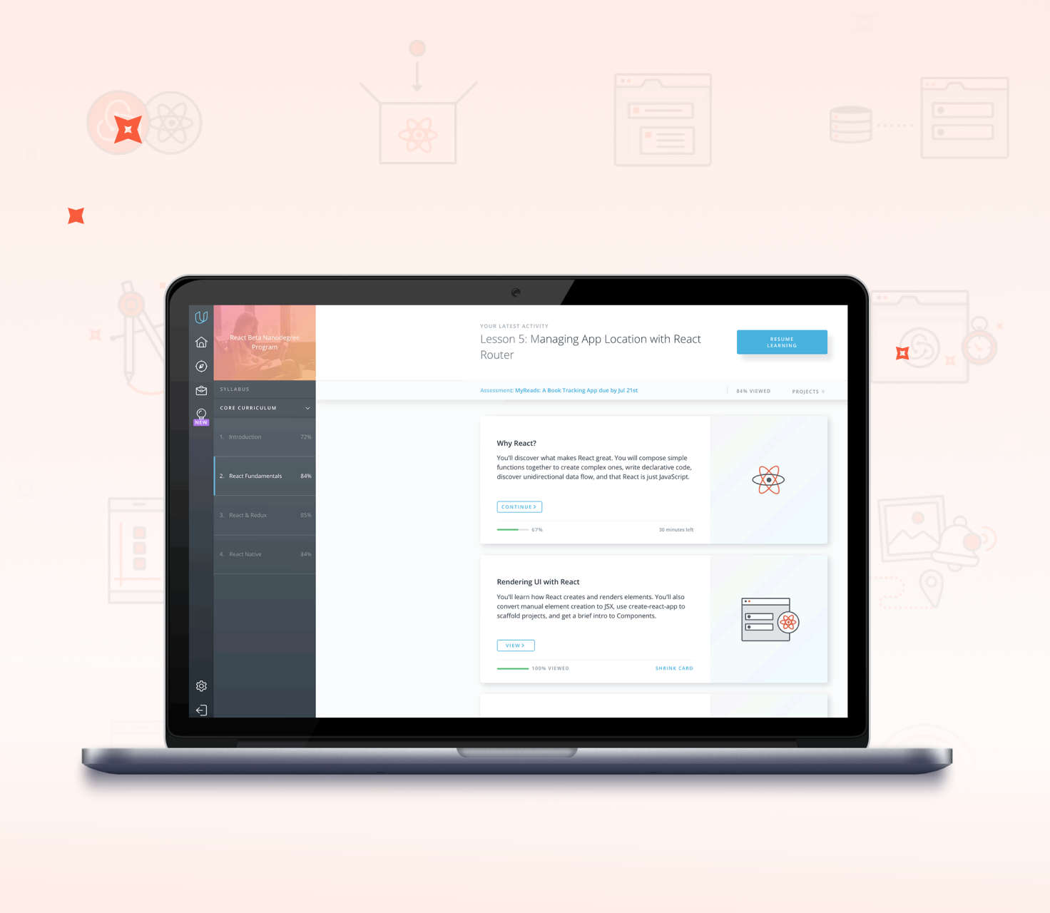
The React Nanodegree program is one example of how I used the style of illustrations I developed to create a branded look for the lessons.

Project Outcome
This project was so much fun. I really enjoyed the opportunity to elevate the student experience through branded illustrations. Initially, it posed a challenge to design so many lesson images efficiently. However, through close collaboration with the class leads and fellow designers, we developed a streamlined process that benefitted everyone involved. The outcome was a set of uniquely branded lessons within the Nanodegree programs, helping students to easily identify their progress. The positive feedback we received after each set of illustrations led to an increasing demand for our assistance from class leads.